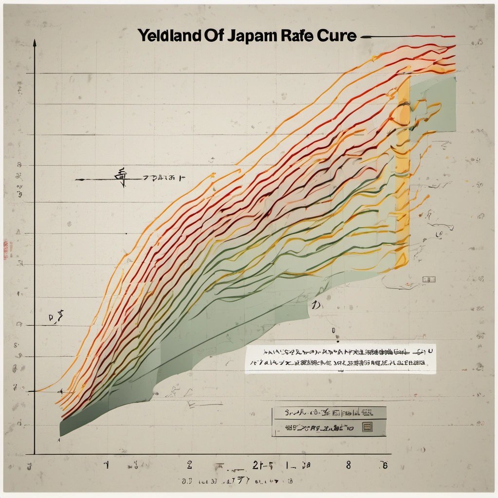
In a truly mind-boggling turn of events, the Bank of Japan has managed to astonish financial experts and analysts around the world with a yield curve that bears an uncanny resemblance to the country of Japan itself. Yes, you read that right – the yield curve, a graphical representation of interest rates on bonds of varying maturities, has taken on the shape of one of the most iconic countries on the planet.
Financial analysts, economists, and traders have spent countless hours analyzing and deciphering yield curves, trying to predict market trends and make informed investment decisions. However, they were certainly not expecting to see a yield curve that so closely resembled the very country with which they were familiar. The discovery of this extraordinary similarity has left experts scratching their heads and scrambling to make sense of it all.

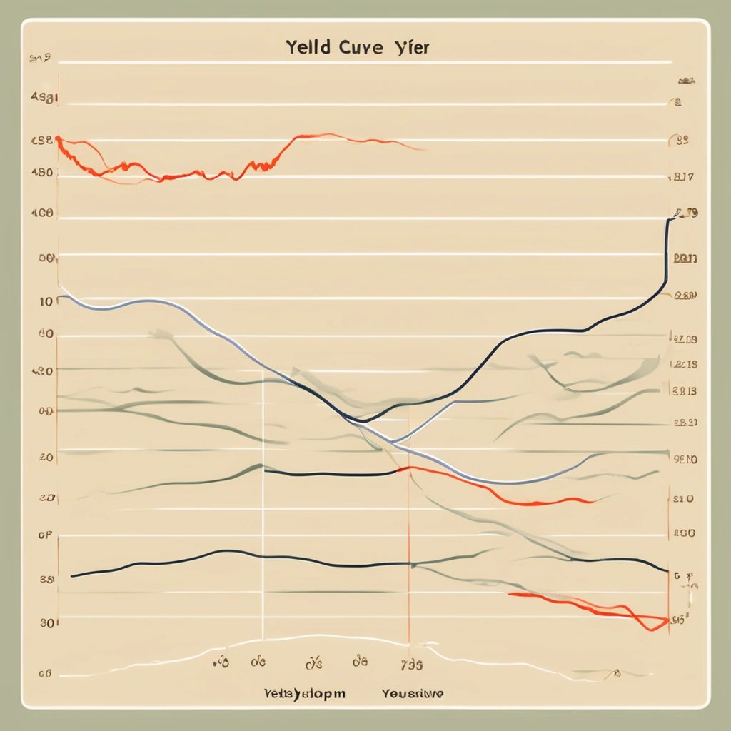
Traditionally, yield curves are expected to exhibit certain shapes that provide insights into the state of the economy and the market. These shapes can range from upward sloping (indicating positive economic growth) to flat (indicating economic stability) to downward sloping (indicating an impending recession). However, rarely, if ever, has a yield curve assumed the form of a country on the global map.
So, why does the yield curve from the Bank of Japan look like Japan? There are several theories circulating among financial experts and economists, each trying to make sense of this seemingly inexplicable phenomenon.
One hypothesis suggests that the striking resemblance is merely a coincidence, a random alignment of interest rates that happened to coincide with the unique shape of Japan's archipelago. According to this theory, it is simply a remarkable example of pareidolia - the tendency of the human brain to perceive meaningful patterns or shapes in random or unrelated stimuli.

Another theory proposes that the creation of the yield curve in the shape of Japan was an intentional act by the Bank of Japan, driven by a desire to make a visual statement about the relationship between the country's monetary policy and its economic landscape. According to this line of thinking, the central bank sought to convey a message about the interconnectedness of finance and geography, highlighting the impact that interest rates can have on the economic growth and stability of a nation.

Yet another hypothesis suggests that the relationship between the yield curve and the shape of Japan is purely coincidental, but it serves as a sobering reminder of the complexity and interconnected nature of the global financial system. This theory argues that the yield curve's resemblance to Japan serves as a visual metaphor for the intricacies and uncertainties inherent in the world of finance, where seemingly unrelated factors can unexpectedly converge and influence market dynamics.
Regardless of the underlying reason, one thing is for certain – the Bank of Japan's yield curve has sparked curiosity, bewilderment, and debate among financial circles around the world. The uncanny resemblance between the yield curve and the country of Japan has defied expectations and left even the most seasoned experts questioning their understanding of the intricacies of global finance.
As financial analysts and economists continue to grapple with this puzzling phenomenon, one can only wonder what other surprises the world of finance has in store. Will other central banks follow suit and create yield curves that mirror their respective countries? Only time will tell. Until then, experts will continue to analyze, interpret, and speculate on the true meaning behind this unexpected convergence of economics and cartography.