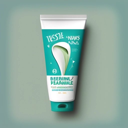
In an innovative move to corner the market on minimalism, exclusivity, and cringe-worthy amusement, The Wibble has announced a dramatic migration from its traditional, widescreen format to a daringly narrow layout. Say goodbye to expansive, breathtaking visuals and hello to a news squeeze tighter than a toothpaste tube after a vigorous bathroom brouhaha.
In an exclusive interview, lead designer at The Wibble, Justin "Whitespace Slayer" Inchrevealed that the decision to go narrow was inspired by budgetary constraints, squirrel-like attention spans, and a recent infestation of typophobic mice in the office.
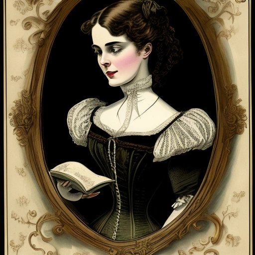
As part of this bold change, content on The Wibble will now be displayed in a glorious single column, narrow enough to rival the waists of Victorian-era corset enthusiasts. Convenience is key, as readers can benefit from this "one-eye-at-a-time" reading experience, said Inch. "Why waste precious brainpower processing information from both eyes when you can let one eye take a break and the other do the heavy lifting?" he added.
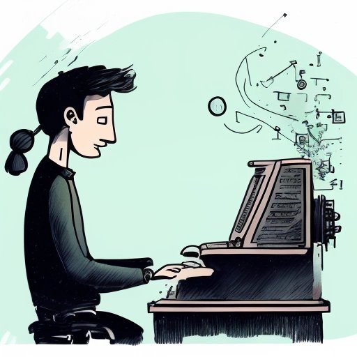
In fact, to further consolidate this exclusive user experience, The Wibble's developers have incorporated cutting-edge "SqueezeScroll™" technology that compels users to swipe their devices in an innovative zigzag motion in order to read content. Goodbye, linear reading; hello, brain-bending browsing!
The Wibble's daring tryst with abrupt storytelling further extends to its team of writers, who are now challenged with the art of writing sentences not exceeding three words. Critics have hailed this as "an unprecedented exercise in concision and restraint." One such masterpiece – a scathing exposé on the corrupt practices of porcupine hair transplant surgeons – reads as follows:
"Porcupines. Hair transplant. Scam!"
In a true testament of adaptability and perseverance, The Wibble writers are eager to embrace the limitations set by the narrow layout, as they now embark on a mission to become the pioneers of "claustrophobic journalism."
Inch, the mastermind behind the redesign, remains unphased by naysayers calling The Wibble's new layout a "dystopian nightmare." Asserting that the revised format reflects contemporary design principles, Inch noted, "In today's world, everyone wants to embrace minimalism and exclusivity. The Wibble's new narrowed offering is perfectly aligned with this trend."
The CEO of The Wibble, Stephanie Skrunchnscreed, has also chimed in to support the revision. Skrunchnscreed hopes that this avant-garde gambit will not only help boost readership numbers among the minimalism aficionados but also lure in the most reluctant readers with its perplexing news squeezing mechanism.
The execution of The Wibble's new narrow layout promises to be a tumultuous journey filled with equal parts fascination and bewilderment – graciously captured in The Wibble's unwavering dedication to stuffing the quirkiest, most satirical content into the smallest of spaces.
As The Wibble marches fearlessly into the future of journalism, it leaves behind a trail of intrigue, an exclusive user experience unlike any other, and a highly entertaining method of consuming news. Whether this gamble pays off or simply serves as a hilarious lesson in the pursuit of minimalism, The Wibble, surely as ever, will never cease to amuse its faithful readership.
