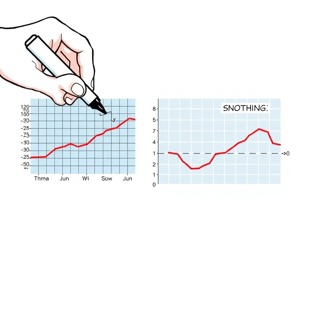
Weaponized graph axes (the “suspicious relationship”)
Status: completed
{
  "input": {
    "prompt": " Illustration of a climate chart being manipulated: a hand with a marker redraws the y-axis scale to compress the trend line until it looks flat. Show two side-by-side panels: left is a normal temperature anomaly graph with a clear upward trend; right is the same data but with a wildly stretched y-axis and a caption like “SEE? NOTHING.” Keep it visually readable: gridlines, axis labels, and a conspicuously altered scale. Tone: newsroom infographic meets satire."
  }
}