Image prompt
S Tier letters as “narrative dominance” icons
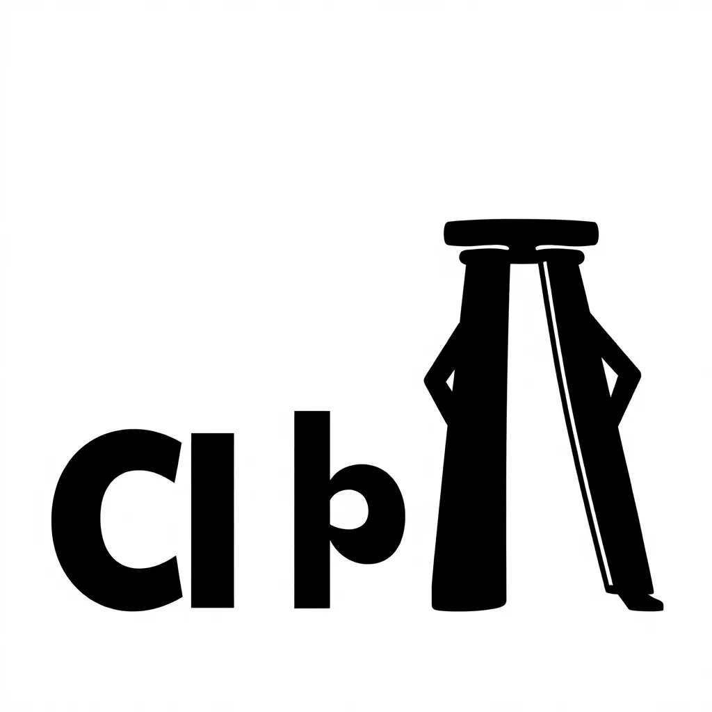
Illustration of three bold, black lowercase letters—c, r, b—posed like minimalist superheroes on a clean white background. “c” is shown as adaptable (half shaded soft/rounded, half sharper/harder), “r” casts a dramatic shadow like a film-noir character, and “b” stands sturdy like a pillar (subtle bread motif: a loaf silhouette or wheat icon behind it). Keep it typographic, not too cartoony; the joke is in the posture and lighting: dramatic rim light, confident stance.